
12 Best Fonts for Resumes in 2026 (With Formatting Tips)

Choosing a resume font can make or break your chances of landing a job. Use this guide to pick the right font for your resume.
Updated:
|

16 min read
Table of Contents


The best resume fonts are professional, easy to read, and compatible with applicant tracking systems (ATS). Choosing the right font helps recruiters quickly scan your resume and ensures ATS software can accurately process your information.
In this guide, you’ll learn the best fonts for resumes, how to choose the right one for your industry, which fonts to avoid, and formatting tips to create a polished, professional resume.
Why Your Resume Font Matters
Your resume font affects how easily recruiters and ATS can read your resume. A clean, professional font improves readability, supports ATS compatibility, and helps create a strong first impression.
Beyond automated screening, recruiters take six seconds to decide whether or not to toss your resume. If a recruiter can’t read your words or is put off by an overly stylized font, you won’t get a second look, so the right resume font and resume font size make a big difference.
12 Best Resume Fonts in 2026
Here’s a list of the best resume fonts, including serif and sans-serif styles, ATS-friendly options, pros and cons, and visual examples of how each font looks:
- Calibri
- Cambria
- Garamond
- Georgia
- Helvetica
- Lato
- Merriweather
- PT Sans
- Roboto
- Tahoma
- Trebuchet MS
- Verdana
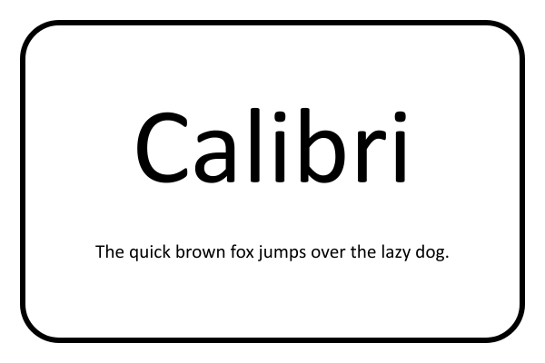
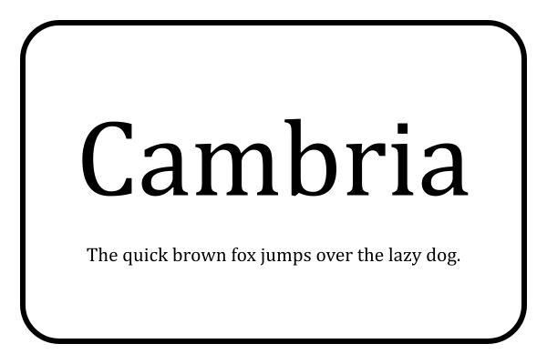
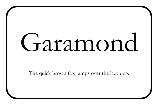
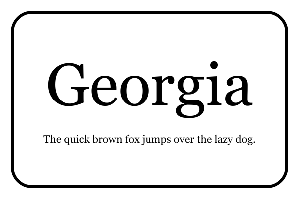
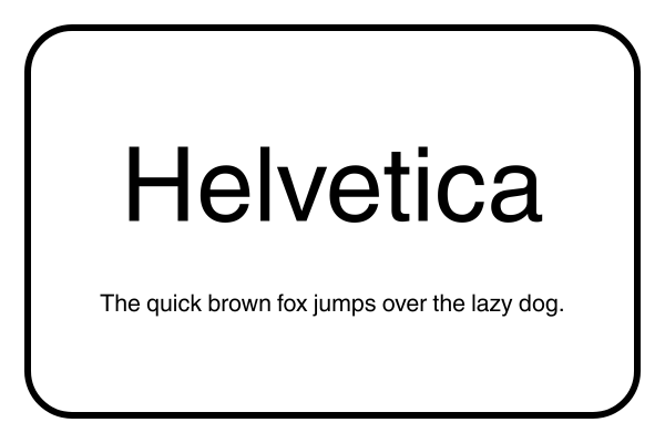
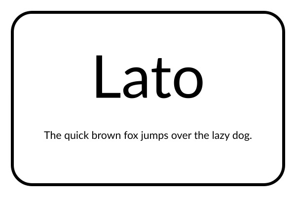
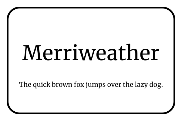
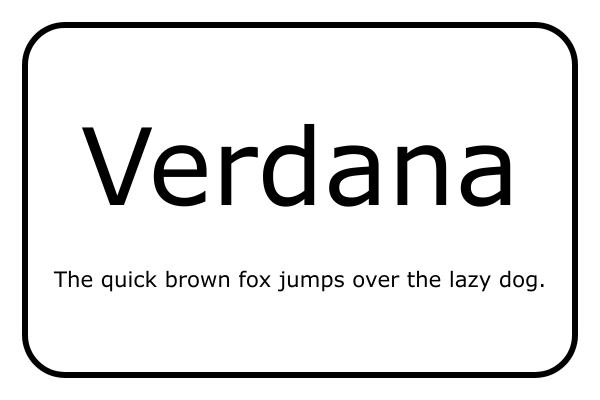
Note: The phrase “The quick brown fox jumps over the lazy dog” is used in each font example because it’s an English pangram, meaning it contains every letter of the alphabet at least once. This makes it a useful way to compare how each font displays different letter shapes and styles.
- 1.
Calibri
Calibri is a modern, sans-serif font that’s clean, professional, and easy to read on screens and in print. As the long-time default font in Microsoft Word, it’s widely recognized and accepted by recruiters, making it a safe choice for most industries.
- Pros: Readable and ATS-friendly, professional and familiar to employers, works well for both body text and headings
- Cons: Commonly used, so it may not stand out visually, and slightly less formal than traditional serif fonts
- 2.
Cambria
Cambria is a serif font designed for readability both on-screen and in print. It has balanced letterforms and slightly wider spacing that make resumes look polished and formal. Cambria is often considered a modern alternative to Times New Roman.
- Pros: Professional, classic serif font with high screen readability
- Cons: Less modern or trendy than sans-serif fonts, may feel too formal for creative industries
- 3.
Garamond
Garamond is an elegant, classic serif font known for its timeless style and readability. It gives resumes a professional and sophisticated look, making it a great choice for more traditional industries, such as law or finance.
- Pros: Traditional serif font that’s visually appealing but still readable
- Cons: Can appear too formal for modern industries and startups
- 4.
Georgia
Georgia is a classic serif font characterized by slightly larger letters and an elegant style. This professional yet approachable resume font gives resumes a polished, traditional look without feeling outdated.
- Pros: Classic appearance suitable for many industries, works well in both digital and printed resumes
- Cons: May feel too traditional for very creative or tech-focused roles
- 5.
Helvetica
Helvetica is one of the most widely used fonts, with a huge impact in the world of graphic design. This sans-serif font is known for its high readability, simplicity, and modern design, often associated with Apple products and operating systems. If you want your resume to look professional and cutting-edge without sacrificing simplicity, Helvetica is the font for you.
- Pros: Sleek but professional appearance, versatile, widely recognized across industries
- Cons: May feel overused, can look impersonal
- 6.
Lato
Lato is a modern sans-serif font with a clean yet friendly appearance. Its balanced letterforms and open spacing make it an approachable font that works for all industries and professions without sacrificing professionalism.
- Pros: Highly readable in both digital and print formats
- Cons: May feel too casual for highly conservative industries
- 7.
Merriweather
Merriweather is a serif font with a classic, elegant design. This font has balanced letterforms and isn’t overly decorative, so it’s highly readable and appropriate for any industry.
- Pros: Elegant and approachable, high readability for a serif font
- Cons: Can be larger compared to other fonts, so you’ll need to resize appropriately
- 8.
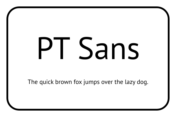
PT Sans
PT Sans is a widely used sans-serif typeface characterized by its clean lines and excellent readability. Its slightly wider letter spacing and subtle character design create a professional yet approachable look, suitable for both creative and corporate fields.
- Pros: Clear, easy-to-read design that looks great on screens, widely available for free
- Cons: May appear too casual for very formal or conservative industries
- 9.
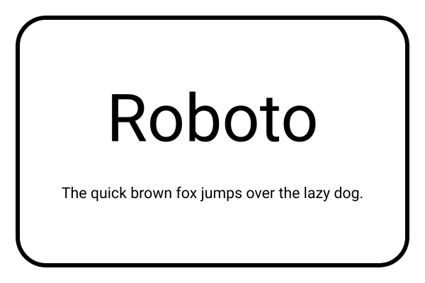
Roboto
Roboto is a modern sans-serif font with a clean, contemporary look that remains highly readable. Its geometric letterforms, combined with slightly rounded edges, create a professional yet approachable appearance. Roboto is highly legible on both screens and in print, and it works well for resumes in tech, corporate, and creative industries.
- Pros: Contemporary design and highly readable
- Cons: May feel too design-forward for more traditional industries
- 10.
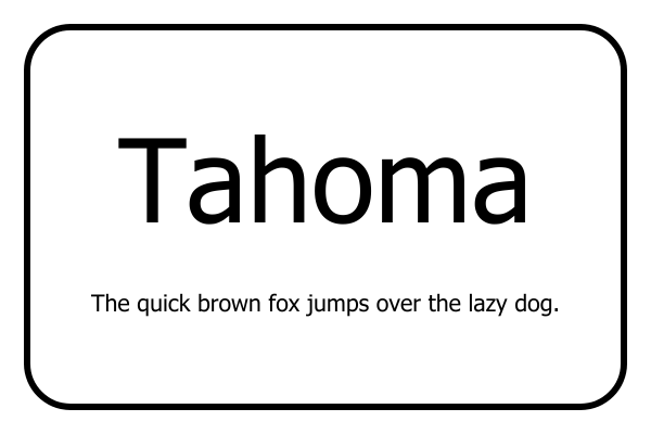
Tahoma
Tahoma is a clean, sans-serif typeface that’s slightly narrow, so it’s useful for fitting a lot of content into a small space. Ideal for resume body text and headings, Tahoma has great screen readability.
- Pros: Simple and space-conscious typeface ideal for screens
- Cons: Has bold and regular styles but no italics
- 11.
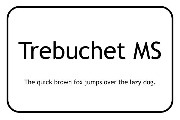
Trebuchet MS
Trebuchet MS is a unique sans-serif font characterized by a splay-footed “M” and a two-story “g,” which give this otherwise simple typeface some character. It’s a versatile choice that’s great for section headings as well as body text.
- Pros: A simple font for job seekers who want something a bit different
- Cons: Might not look formal enough for certain industries
- 12.
Verdana
Verdana is a sans-serif font designed specifically for low-resolution computer monitors, making it one of the best fonts for a resume in terms of readability. Its modern, straightforward appearance makes it easy to scan, which is especially useful for online applications analyzed by an ATS.
- Pros: ATS-friendly and widely available
- Cons: May take up more space due to wider letter spacing
How to Choose the Best Font for Your Resume
The best resume font depends on your industry, resume style, and how your resume will be viewed. Regardless of which font you choose, prioritize readability, professionalism, and ATS compatibility.

Qualities of a Good Resume Font
A good resume font is professional and easy to read. When deciding between fonts, consider the following characteristics to ensure your choice is appropriate for a resume:
- Readability: Choose a visually clear font. Each letter should have a consistent shape and spacing, without being too thin, too thick, or overly decorative.
- Professionalism: Use fonts that convey a polished, professional tone. Classic options like Calibri, Georgia, or Helvetica are safe choices, while playful fonts like Comic Sans can make your resume look unprofessional.
- Simplicity: Keep your font design clean and minimal. Avoid decorative elements or complex shapes that can distract from your skills and achievements.
- Compatibility: Pick fonts that display consistently across devices or ATS. Widely available options, such as Cambria, Garamond, or Verdana, ensure your resume looks the same for every recruiter.
If you want your resume to look polished without the guesswork, a resume builder can automatically format it using recruiter-approved fonts and optimal sizing.

Serif vs Sans-Serif Fonts: What’s the Difference?
Both serif and sans-serif fonts are appropriate for resumes because they’re professional and easy to read. The best choice depends on the impression you want to make and whether your resume will primarily be viewed digitally or in print.
- Serif fonts (like Times New Roman or Georgia) have small strokes at the ends of letters, giving them a classic, traditional look.
- Sans-serif fonts (like Calibri or Helvetica) have clean, modern lines that are easier to read on screens.
If you’re unsure which to choose, sans-serif fonts are generally a safer bet for digital resumes and online applications.

Best Resume Fonts by Industry
Choosing a font that matches your industry can reinforce the impression your resume makes. While readability should always come first, certain font styles tend to align better with different fields.
Here are some resume font suggestions based on industry:
Academic, Research, or Education
- Recommended fonts: Cambria, Georgia
- Why these fonts work: They’re classic fonts that look polished and credible. Their elegance conveys expertise and attention to detail.
Corporate or Business
- Recommended fonts: Calibri, Helvetica, Tahoma
- Why these fonts work: They’re clean, simple, and easy to read. They convey reliability and structure, making them ideal for traditional business settings.
Creative Fields (Design, Marketing, Media)
- Recommended fonts: Lato, Garamond, Roboto
- Why these fonts work: They’re stylish yet readable and add personality without sacrificing professionalism.
Nonprofit or Public Sector
- Recommended fonts: Calibri, Garamond, Merriweather
- Why these fonts work: These balanced, approachable fonts communicate trustworthiness and professionalism while maintaining readability.
Technology & Startups
- Recommended fonts: Helvetica, Roboto, Lato
- Why these fonts work: They’re modern and minimalist fonts that project innovation with their sleek letterforms—perfect for forward-thinking industries.

Best Resume Font Combinations
While you can use the same font throughout your entire resume, it’s not uncommon to use a pair of complementary fonts for your body text and your headings. However, choosing two different fonts that pair well requires a good eye for design and aesthetics.
If you want your resume to stand out with this level of attention to detail, consider the following resume font combinations:
- Cambria and Calibri: A timeless serif and sans-serif pairing, use Cambria for section headings and Calibri for body text to create a clean, balanced, and highly readable resume design.
- Garamond and Lato: Blend Garamond’s elegant, thin strokes with Lato’s simple, modern forms. This combination delivers clarity and sophistication suitable for any industry.
- Georgia and Helvetica: Combine Georgia’s authoritative serif style with Helvetica’s modern, minimalist look. This pairing strikes the perfect balance between tradition and professionalism.
- Roboto and PT Sans: For an all-sans-serif option, pair Roboto’s structured, standout headings with PT Sans’ clean, legible body text. It’s a modern, professional look that adds subtle contrast without losing readability.
Fonts to Avoid on Resumes
Not every font works for a resume. Decorative, script, or heavily embellished fonts can distract from your content, appear unprofessional, and may even be misread by ATS. To avoid these issues, stick to clean, simple typefaces for maximum readability.
Some examples of resume fonts to avoid include:

Brush Script or Lobster: Overly stylized, handwritten-looking fonts are highly unreadable in a resume and aren’t compatible with all operating systems or ATS.
Comic Sans: This font is overly casual and unprofessional for a job application.
Lucida Handwriting: Handwritten fonts like this one might feel elegant, but they can be hard to read in a letter-sized document with lots of text.
Papyrus: Decorative fonts like Papyrus look out of place and are difficult to read in smaller sizes.
Resume Font Size & Formatting Tips
Resume font size and formatting are just as important as the font itself. Even a professional font can become difficult to read if it’s too small, too large, or inconsistently formatted.
As a general rule, set your resume’s body text between 10 and 12 points for optimal readability. Test different sizes within that range to ensure your content is easy to read and fits neatly on one page. Use slightly larger fonts, typically 14 to 16 points, for section headings to create hierarchy, and keep font choices consistent for a polished, cohesive look.
To ensure your resume has optimal readability and a balanced layout that supports your chosen font, follow these tips:
- Line spacing: Use 1.0–1.15 line spacing for body text. Extra spacing improves legibility and prevents your resume from looking crowded.
- Margins: Stick to one-inch margins on all sides to provide enough white space to frame your content without wasting space.
- White space: Don’t underestimate the power of breathing room. Strategic spacing between sections makes your resume easier to skim and more visually appealing.
- Standard section headings: A professional resume benefits from clear, standard section headings (like “Resume Summary” or “Work Experience”) set in the same font as your body text or a complementary style. Consistent headings improve readability, guide the reader’s eye, and ensure your resume looks organized and polished.
- File type: Always save and send your resume as a PDF to preserve font consistency across devices. Word documents and Google Docs can render fonts differently, depending on the reader’s settings.
Checklist for a Well-Formatted Resume
Resume formatting is key to making an effective resume that’s easy for recruiters to scan and compatible with hiring algorithms. Because a lot goes into choosing the best font for you and ensuring your resume looks professional, we’ve compiled a checklist you can use when writing your resume:

Avoid decorative, script, novelty, or overly stylized fonts for your resume.
Use simple but professional resume fonts that are easy to read and have proportionate letterforms.
Stick to one font family for your resume’s content, or use a pair of resume fonts that go well together.
Choose a font that matches your industry, such as classic fonts for corporate roles and modern fonts for creative fields.
Use a smaller font size for your resume’s body text and a larger one for section headings.
Use bold, italics, or underlining sparingly to emphasize section headings, employment details, and key achievements.
Use line spacing to declutter your resume and improve readability.
Establish consistent margins to prevent your resume from looking cramped.
Save and send your resume as a PDF file to preserve your fonts and layout.
Choose the Right Resume Fonts for a Strong Impression
While the content of your resume is what matters most, the font you choose plays a key role in the impression you make on potential employers. A clean, professional typeface helps you showcase achievements and qualifications clearly, while a poorly chosen resume font can distract from your experience.
Prioritize readability above all; less flourish is always better for a resume font. Classic, widely recognized fonts like Calibri, Helvetica, and Georgia are safe and professional choices. Modern, design-forward options like Merriweather and Roboto can help your resume feel polished and contemporary.
Ultimately, you should select a resume font and a resume template that align with your industry, complement your style, and enhance your resume’s readability to leave a strong, positive impression on employers.
Frequently Asked Questions
What’s the most professional font?
Calibri, Helvetica, Cambria, Georgia, and Garamond are among the most professional fonts for a resume. These fonts are widely recognized, easy to read, and compatible with ATS software, making them safe choices for most industries. Choose the font that best matches your industry while prioritizing readability over style.
Can I use different fonts for different sections of my resume?
You can use two complementary fonts on your resume—typically one for headings and one for body text—but using more than two would be a resume mistake. Keeping your font choices consistent creates a professional appearance, improves readability, and helps ensure your resume remains easy for recruiters and ATS to scan.
Are custom or branded fonts safe to use on a resume?
Custom or branded fonts generally aren’t recommended for resumes because they may not display correctly across devices or be compatible with ATS. Widely available fonts like Calibri, Helvetica, or Georgia are safer options that preserve readability and consistent formatting when saved or downloaded as a PDF.
Do font choices affect how hiring managers perceive me?
Yes, your resume font influences the impression you make on hiring managers. Clean, professional fonts suggest organization and credibility, while overly decorative or difficult-to-read fonts can distract from your qualifications and make your resume appear less professional.
Should I change fonts for a creative vs a corporate resume?
You can choose a font that reflects your industry, but readability should always come first. Corporate resumes often use classic fonts like Cambria or Georgia, while creative fields may favor modern fonts like Roboto or Helvetica. Regardless of your industry, choose a clean, ATS-friendly font that’s easy to read.

Megan Dawkins is a career industry editor who empowers job seekers to take control of their career paths using Monster’s comprehensive job search and resume tools. She specializes in helping job seekers navigate the flexible job market.
See More From Megan DawkinsExplore Related Career Advice
Cashier Career Paths: Monster Workforce Mobility Report (Volume 2)

Updated:
Oct 19, 2026
|
9 min read

Highest Paying Medical Jobs: 35 Top Healthcare Careers by Salary

Updated:
Oct 16, 2026
|
18 min read

How to Ask for a Raise at Work: Steps, Scripts, & Email Templates
Updated:
Oct 15, 2026
|
20 min read

Job Hugging Statistics: Nearly 9 in 10 Workers Have “Hugged” a Job
Updated:
Oct 13, 2026
|
9 min read

Nearly 3 in 10 LinkedIn Users Have Updated a Past Job After Leaving It
Updated:
Oct 7, 2026
|
7 min read

Employee Loyalty Statistics: 90% Say Companies Expect More Than They Give
Updated:
Oct 5, 2026
|
7 min read


Overqualified Hiring Stats: 57% Would Cut Resume Experience to Get Hired
Updated:
Sep 28, 2026
|
9 min read

20 First Job Interview Questions & Sample Answers: Tips to Land Your First Job
Updated:
Sep 24, 2026
|
20 min read
Manage Your Career Like an Expert
Take control of your professional journey with Monster’s expert resources. Explore advice, research, and tips to make informed decisions and advance your career with confidence.

Job Search
Discover strategies to get noticed, network effectively, and streamline your job search process.

Resumes
Get practical tips to create a resume or CV that stands out to employers and wins interviews.

Cover Letters
Learn how to craft a compelling cover letter that highlights your experience and fit for the role.

Career Paths
Explore career paths, industry trends, and growth opportunities to plan your next move.

Interviewing
Prepare for interviews with tips on answering common questions and following up effectively.

Career Development
Develop key skills and knowledge to grow in your current role or pivot to new opportunities.

Leaving a Job
Navigate job changes and career transitions with practical advice and planning resources.