
What Should a Resume Look Like in 2026? Format & Examples
Learn what employers expect from resumes in 2026: layout rules, section order, formatting, and design tips, with examples and a final checklist.
Updated:
|

14 min read

Table of Contents
Wondering, “What should a resume look like?” A good resume in 2026 is clean, professional, easy to scan, and tailored to the job you’re applying for. The best resume templates use consistent formatting, clear section headers, and highlights measurable achievements. Just as important, it’s formatted so applicant tracking systems (ATS) can scan it properly.
In this guide, we break down what those standards look like in practice and how to apply them to your own resume, including:
- What a good resume should look like at a glance
- Essential resume sections and the right order to list them
- Three main resume formats and when each one works best
- Visual design rules that support ATS compatibility and readability
- Common resume design mistakes to avoid
- Resume examples by experience level and career context
- A final checklist to confirm your resume meets today’s standards
What a Good Resume Should Look Like at a Glance
Before a recruiter reads a single bullet point, your resume is evaluated visually. So, layout and structure matter. How information is arranged determines what’s noticed quickly and what’s missed.
The 7-Second Resume Scan Rule
Recruiters typically spend about seven seconds deciding whether a resume is worth a closer look. In that time, they’re checking whether they can identify your current or target job title, recent employers and roles, relevant skills, and overall fit for the position.
Easy-to-scan section headers, logical order, and consistent formatting make it easier for recruiters to confirm fit within those first few seconds and decide to keep reading.
F-Pattern vs Z-Pattern Resume Scanning
Recruiters scan resumes in predictable visual patterns:
- F pattern: Moving across the top of the page and then down the left side, looking for headings and keywords.
- Z pattern: Scanning from top left to top right, then diagonally down the page before finishing at the bottom.
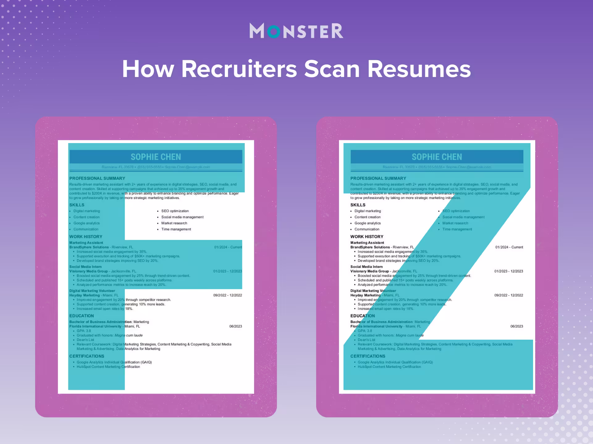
These scanning patterns, shown above, are the most common. Because you can’t be sure which pattern a recruiter will use, your resume should support both.
7 Essential Resume Sections in the Right Order
The presence and order of your resume sections signal your level of experience, priorities, and what you want a recruiter to focus on first. While there are valid reasons to adjust section order, changes should be intentional and tied to your experience or career context, not made for stylistic reasons alone.
Below are core resume sections employers expect in the order that works best for most job seekers.
- 1.
Resume Header
Your resume should begin with a header that displays your name and, when relevant, your job title and/or credentials. Only include your credentials if they add professional value. Informal labels or unrelated descriptors can appear unprofessional and should be avoided.
For example, “Joseph Suarez, CPA” is appropriate for an accounting, auditing, finance, or tax role.
- 2.
Contact Information
At or near the top of the page, include your contact information:
- Phone number
- Professional email address
- Location (city and state)
You can also include a link to your LinkedIn profile, portfolio, or personal website if it’s relevant to your field and supports your application.
In a single-column resume, contact details usually appear on one line beneath your name or alongside it, depending on the design. In a two-column resume layout, contact information often appears at the top of the left-hand column.
- 3.
Professional Summary or Objective
A professional summary is a brief snapshot of your experience, skills, and career focus. It’s the most common choice for candidates with a relevant work history who want to highlight qualifications upfront.
A resume objective, which emphasizes career goals and transferable skills, is better suited for entry-level candidates, recent graduates, or career changers.
Either option should be concise, role-specific, and tailored to the job you’re applying for.
- 4.
Work Experience
For most resumes, your work experience section should be the main focus. Roles are typically listed in reverse-chronological order, starting with your most recent position. If you’ve earned promotions or held multiple roles at the same company, list each title separately under the same employer to show your career progression.
Rather than listing day-to-day duties, each role should highlight results and impact. Use concise bullet points that focus on achievements, such as:
- Measurable outcomes
- Improvements or efficiencies created
- Revenue, growth, or performance contributions
- 5.
Education
The education section usually follows work experience, though recent graduates may place it higher depending on the resume format they choose.
Include your degree and institution name. You can include your graduation year, but if you obtained your degree more than 10 years ago, leaving it out may help prevent ageism in the hiring process.
Additional details, such as coursework, honors, or GPA, should only be included if they add value. For example, recent graduates may list relevant coursework to demonstrate subject matter knowledge.
- 6.
Skills
The skills section highlights your hard skills, soft skills, and role-specific competencies. It’s also where keyword alignment matters most, since an ATS scans this section to assess fit.
Prioritize skills that closely match the job description and avoid outdated or overly broad entries. Skills typically appear near the end of the resume or along the left side in a two-column layout.
- 7.
Optional Resume Sections to Include When Relevant
Optional sections can strengthen a resume when they provide context or demonstrate qualifications not covered elsewhere.
These may include:
- Certifications
- Major projects
- Volunteer work
- Publications
- Professional affiliations
3 Resume Format Options and When to Use Them
Resume format affects both readability and ATS compatibility, and it’s one of the main reasons the section order outlined above may change.
There are three standard resume formats employers recognize. Each serves a different purpose depending on your experience level, career path, and goals.
1. Chronological Resume Format
The chronological resume is the most common and widely accepted format. It lists your work experience in reverse-chronological order, starting with your most recent role and working backward.
This format is shown below and works best if you have a steady work history in the same field and want to show career progression. Recruiters and ATS software are very familiar with it, making it the safest choice for most job seekers.

2. Functional Resume Format
The functional resume focuses on skills and abilities rather than job history. Experience is grouped by skill categories, with employment details listed briefly or near the bottom.
This format, shown in the example below, is sometimes used by career changers, people with employment gaps, or those reentering the workforce. Many recruiters and ATS software, however, prefer chronological formats. Functional resumes can be misread or ignored by an ATS, so they should be used carefully and intentionally.

3. Combination (Hybrid) Resume Format
The combination, or hybrid, resume blends elements of both chronological and functional formats. It typically places the skills section immediately after the professional summary, with the work experience section to follow.
As seen in the example below, this format works well for experienced professionals, career changers, or those with strong transferable skills who still want to show their work history. Done well, a combination resume highlights skills upfront without hiding your work history from recruiters or ATS.

Critical Visual Design Principles for Resumes
All the mentions of ATS in this guide are intentional. These systems scan resumes for keywords and criteria tied to the job description, along with filters set by hiring managers or recruiters.
Poor formatting, unreadable layouts, or certain file download options can prevent your resume from being scanned by an ATS and make it harder for real people to scan. You don’t want design choices unrelated to your experience standing between you and a job.
These principles ensure your resume is readable, professional, and doesn’t accidentally work against you:
| Element of a Resume | Design Guidance |
| Font choices and sizes | Professional, easy-to-read fonts (e.g., Arial, Calibri, Georgia, or Times New Roman) with consistent sizing support readability and ATS scanning. Font size should be between 10 and 12 points for the body and 14 to 16 points for headers. |
| Margins | Standard one-inch margins help keep your resume balanced and readable while preventing content from appearing cramped or overwhelming. |
| Columns | Single-column layouts are the safest option for an ATS. Multicolumn designs can improve visual appeal, but improper formatting may cause parsing issues. |
| White space and readability | Adequate white space makes your resume easier to scan and draws attention to the most important elements. |
| Consistency and alignment | Consistent spacing, alignment, and formatting create a polished appearance and help recruiters follow information more easily. |
| Clearly labeled section headings | Strong section headers guide the reader’s eye and make it easy to locate important details fast. |
| Industry considerations | Creative roles allow more visual design flexibility. Fields like finance, law, healthcare, and government expect simple, traditional formatting. |
| Resume length | One-page resumes are typically preferred. Multiple pages are best reserved for candidates with extensive, highly relevant experience, so adjust your resume length accordingly. |
| Photo vs no photo | Resume photos are generally discouraged, as they can introduce bias and may cause compatibility issues with ATS. |
 Pro Tip
Running your resume through an online ATS checker, or even completing the entire process with an ATS-friendly resume builder, can ensure your formatting is readable and compatible across systems.
Common Resume Design Mistakes to Avoid
The common mistakes below are some of the main reasons that resumes get skipped, misread, or dismissed before experience is fully reviewed.

Overdesigned templates: Heavy graphics, icons, background colors, various fonts, decorative elements
Dense blocks of text: Long paragraphs, tightly packed sections, over-explained bullet points
Inconsistent formatting or alignment: Shifts in font size, bullet style, spacing, or alignment
Visual elements that interfere with scanning: Charts, text boxes, tables, and embedded graphics
Unclear section structure: Missing, vague, or poorly labeled headers
Below is a comparison between a resume with common mistakes and a corrected version.
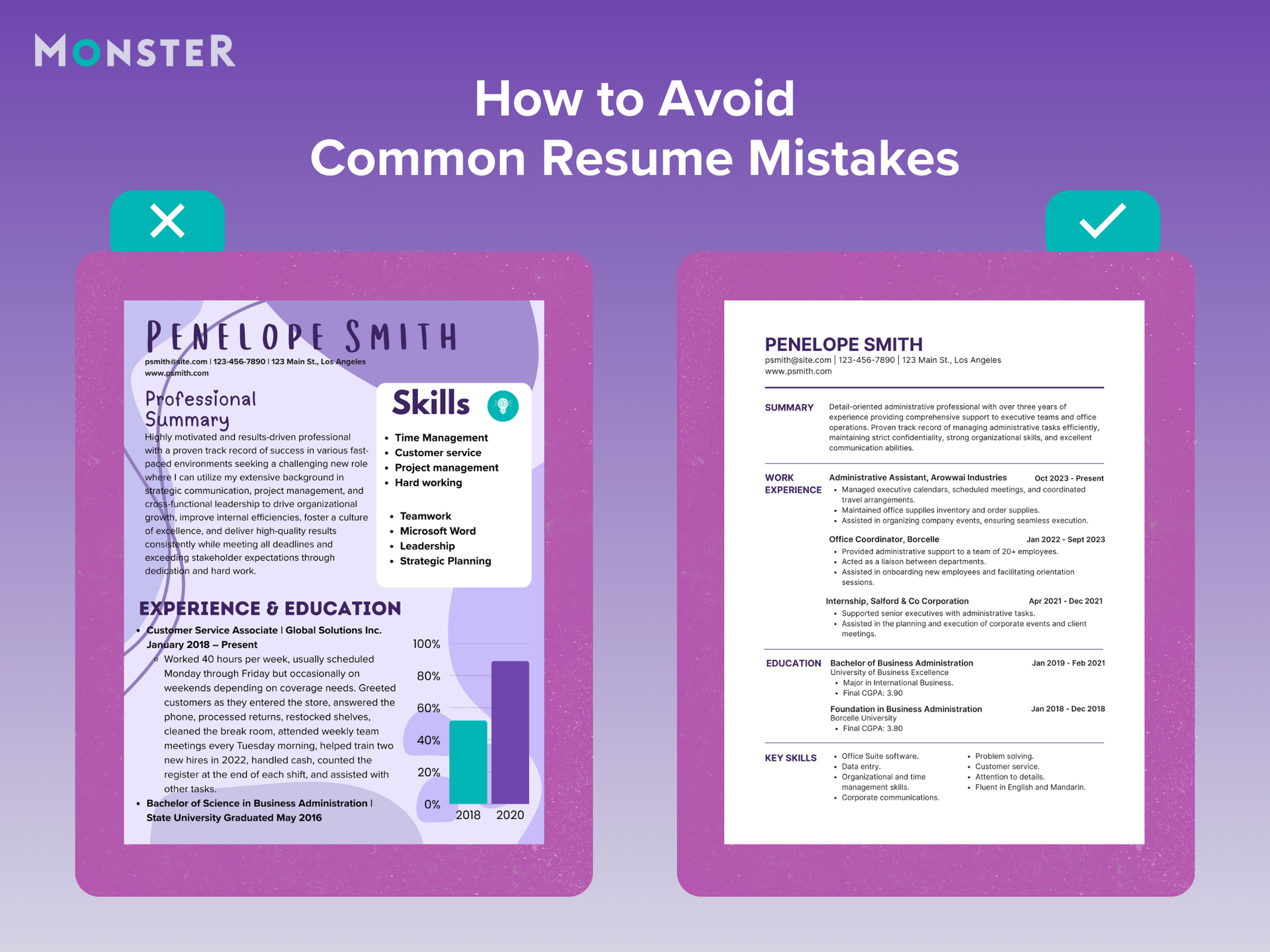
This resume on the left includes several common issues that make it harder to scan and assess quickly, even though the experience displayed may be relevant.
The corrected resume on the right is easier to read and more detailed, painting a full and impressive picture of the professional.
5 Resume Examples by Experience Level and Career Context
Resume content, structure, and design can shift based on experience level, career stage, and professional context, as shown in the examples below.
Example 1: Entry-Level or Recent Graduate
This example shows how to structure a resume when professional experience is limited and education, skills, and early experience need to carry more weight.

- Objective signals career direction without overreaching
- Relevant coursework supports qualifications when work history is limited
- Internships and volunteer work demonstrate transferable skills
- Combination format places skills near the top for faster context
Note: A functional resume can be a reasonable choice in this case, but it remains a higher-risk format compared to chronological or combination resumes.
Example 2: Mid-Career Professional
This example highlights how to present several years of experience clearly while emphasizing growth, impact, and measurable results.

- Clean, two-column layout balances readability and visual appeal
- Accomplishments are supported with measurable outcomes
- Career progression is easy to identify at a glance
- Sections are spaced and labeled for quick scanning
Example 3: Senior or Executive Professional
This example demonstrates a streamlined, traditional layout designed to communicate leadership scope and high-level outcomes quickly.

- Simple, traditional design keeps the focus on leadership experience
- Single-column structure supports clarity and ATS compatibility
- High-impact accomplishments emphasize scope and results
- Clear hierarchy makes senior-level experience stand out
Example 4: Creative Professional
This example illustrates how creative professionals can incorporate design elements while maintaining clarity, structure, and readability.

- Visual design reflects creativity without overwhelming content
- Formatting demonstrates design skill and attention to detail
- Experience and skills remain easy to scan
- Balance between personality and professionalism is maintained
Example 5: Career Changer
This example focuses on repositioning existing experience to highlight transferable skills and relevance for a new field.

- Skills-forward structure reduces emphasis on unrelated roles
- Transferable skills are clearly connected to the target field
- Quantified examples reinforce relevance and impact
- Clean formatting supports fast recruiter review
Note: This format can work well for career changers when transferable skills are strong, but it still carries risk due to recruiter expectations and ATS preferences.
Final Checklist: What Your Resume Should Look Like
Use this checklist to confirm your resume meets today’s formatting and readability standards:

Clean and professional overall
Easy to scan in a few seconds
Readable by an ATS
Appropriate length for your experience level
Clear resume outline and headings
Consistent formatting and spacing
Focused on achievements, not just duties
Tailored to the role and industry
A Resume That Works for You
So, what should a good resume look like? As hiring continues to rely on both technology and fast human review, resume design in 2026 favors clean layouts, strong visual hierarchy, and content that earns attention quickly. When design choices reinforce your experience, skills, and impact, your resume and qualifications speak for themselves.
If you’re ready to craft a resume that reflects your strengths, Monster’s Resume Builder can help you create a polished, tailored document that makes it easier for employers to see why you’re the right fit.

Kirsten Chorpenning is a career advice writer who empowers job seekers to take control of their career paths using Monster’s comprehensive job search and resume tools. She specializes in helping job seekers find rewarding jobs in today’s dynamic work environment.
See More From Kirsten ChorpenningExplore Related Career Advice

Worker Financial Security Statistics: Only 50% Can Last 3 Months Without Income

Updated:
Jul 23, 2026
|
8 min read


93% of Workers Say Wages Aren’t Keeping Up With the Cost of Living
Updated:
Jul 20, 2026
|
9 min read


How to Explain Employment Gaps: Examples for Resumes, Interviews, & More
Updated:
Jul 17, 2026
|
20 min read


Manage Your Career Like an Expert
Take control of your professional journey with Monster’s expert resources. Explore advice, research, and tips to make informed decisions and advance your career with confidence.
Job Search
Discover strategies to get noticed, network effectively, and streamline your job search process.
Resumes
Get practical tips to create a resume or CV that stands out to employers and wins interviews.
Cover Letters
Learn how to craft a compelling cover letter that highlights your experience and fit for the role.

Career Paths
Explore career paths, industry trends, and growth opportunities to plan your next move.
Interviewing
Prepare for interviews with tips on answering common questions and following up effectively.

Career Development
Develop key skills and knowledge to grow in your current role or pivot to new opportunities.

Leaving a Job
Navigate job changes and career transitions with practical advice and planning resources.