
Resume Icons: When & How to Use Them Correctly
Learn when and how to use resume icons to highlight key information without confusing ATS software, plus common mistakes to avoid.
Updated:
|

12 min read
Table of Contents
Resume icons can help highlight your contact information, skills, and key sections—when used correctly—but many job seekers struggle to make their resumes visually stand out without confusing applicant tracking systems (ATS) or appearing unprofessional.
If you’ve ever wanted to make your resume design pop, adding resume icons can be a good idea. This guide answers common questions, shows where icons work best, and helps you avoid mistakes that could hurt your chances.
What Are Resume Icons & Their Purpose?
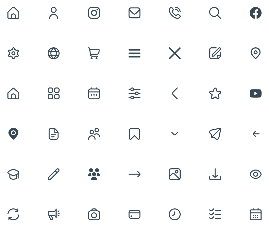
Resume icons are small visual symbols used to organize information, highlight key details, or add a touch of branding to your resume. Sometimes called resume logos, these icons help recruiters quickly scan your resume and draw attention to key sections, such as contact information, skills, and headers, which can increase your chances of getting noticed by hiring managers.
Types of Resume Icons
Not all resume icons are the same, nor do they offer the same level of ATS compatibility. Here’s a breakdown of the main types of resume icons:
- Text-based icons are characters or symbols (e.g., checkmarks ✔ or emojis ✉️) that are part of the font. They’re the safest option for ATS because they’re read as text rather than graphics.
- Vector icons offer clean, scalable graphics (often in SVG format) that maintain quality at any size. They look professional, modern, and may be compatible with some ATS if embedded carefully.
- Image icons are full graphics (e.g., PNG, JPEG, or decorative illustrations) that are visually rich but usually not ATS-friendly and can cause information to be missed or misread.
What Are the Pros & Cons of Using Resume Icons?
Adding icons to your resume can either enhance clarity or create problems, depending on how and where you use them. Consider the pros and cons of using resume symbols to decide if it’s the right choice for your job application:
Pros

Enhances scannability: Icons guide the reader’s eye to important resume sections, making the resume easier to skim.
Highlights key information: Resume icons emphasize contact info, skills, or section headers without adding extra words.
Adds visual structure: You can create a clear hierarchy in your resume using icons that help organize content naturally.
Cons

ATS compatibility issues: Image-based icons can confuse ATS software, leading to key information being missed.
Can appear unprofessional if overused: Too many icons may make your resume look cluttered or gimmicky.
May distract from content: Icons that draw too much attention can overshadow your experience or skills, shifting focus away from your qualifications.
When writing your resume, choosing whether to use resume icons is a personal decision based on the role you’re applying for and the ATS the company uses.
 Pro Tip
For creative roles like graphic design at smaller companies, strategically placed icons can highlight design skills. For non-creative roles or large companies with ATS-heavy screening, stick to a safe, ATS-friendly template that’s visually appealing.
How Do Icons Impact ATS Compatibility?
Resume icons can interfere with how ATS software reads your resume. ATS scans resume text and identifies key data, such as names, contact info, dates, and job titles. Icons saved as images (e.g., PNGs or JPEGs) don’t contain readable text, which can cause important details to be skipped or misinterpreted during parsing.
If an ATS can’t interpret an icon, it may shift surrounding text or ignore that section entirely, meaning your phone number, email, or section headers could be missed by the system.
To avoid misinterpretation, follow these tips for ATS-friendly icon use:
- Use text-based icons, such as font symbols, that are treated as actual text and reliably read by most ATS.
- Use vector icons (SVG) sparingly and embed them carefully to avoid disrupting parsing.
- Limit graphic icons to areas where they won’t interfere with essential information, like decorative section headers rather than contact info.
By keeping icons minimal and choosing formats ATS can read, you protect your resume’s content while still adding visual clarity.
What Are the Best Places to Use Resume Icons?
Using icons strategically can make your resume easier to scan and visually appealing without overwhelming the reader. Icons typically work best in these resume sections:

Contact Information
The safest and most common place for icons is in your contact section or resume header. Small symbols for phone, email, LinkedIn, or location help recruiters quickly identify how to reach you. Text-based icons work best here to avoid ATS issues.

Section Headers
Icons can subtly highlight section titles, such as “Experience” or “Skills,” guiding the reader’s eye across your resume’s outline. Keeping it minimal with just one icon per section is usually enough. Maintain consistent style and size.

Skills Section
Icons can add clarity when showcasing resume skills, especially in creative roles, by grouping or emphasizing categories. Use them sparingly to avoid clutter; too many icons here can make your resume harder to read.
Where Can I Find Free Resume Icons? 6 Options
Here’s where you can find free, high-quality resume icons to use safely and professionally. Using the right icons can make your resume easier to scan, highlight key information, and add a polished, modern look without risking ATS readability.
- 1.
Flaticon
Flaticon* provides a large collection of icons in different styles and categories that can be used to highlight contact info or skills sections.
- 2.
- 3.
- 4.
- 5.
- 6.
The Noun Project
The Noun Project* maintains a library of widely recognizable icons, many of which are free with attribution.
If you want a dynamic resume design that ensures ATS compliance and easy readability, try Monster’s resume templates. They’re automatically formatted and easy to customize. You can adjust colors, fonts, sections, and layout to showcase your strengths and personality without worrying about formatting issues.
*The names and logos of the companies referred to above are all trademarks of their respective holders. Unless specifically stated otherwise, such references are not intended to imply any affiliation or association with Flaticon, Font Awesome, Freepik, Google, Icons8, or The Noun Project.
How to Add Icons to Resumes
Adding icons to your resume is simple, but placement and formatting are crucial to ensure compatibility with ATS and online application forms. The goal is to enhance readability without making your layout harder to scan.
Here’s how to add icons using common tools:
Google Docs
- Click the “Insert” menu, hover over “Drawing,” and click “New” to upload SVG/PNG file resume icons, or paste them directly into your document.
- Find more resume icons in the same “Insert” menu by hovering over “Drawing” and clicking “Special Characters” for a text-based alternative.
- Resize icons so they align cleanly with your text and don’t disrupt line spacing. Icons should complement your text, not dominate it.
- Don’t let icons float freely. Instead, anchor them to text to avoid resume layout shifts.
Microsoft Word
- Insert icons by going to the Insert menu and selecting Icons to choose from Word’s built-in library, or upload SVG/PNG files if you need a specific style.
- Resize icons carefully so they align neatly with your text and maintain consistent spacing across sections. Icons should be no taller than your font size to avoid disrupting line spacing.
- Use Word’s alignment tools, such as Align, Position, and Wrap Text. Set icons to “In Line with Text” to keep them evenly positioned throughout your document and prevent layout shifts.
- Avoid placing icons inside text boxes or shapes, as this can interfere with how ATS reads nearby text.
- Keep essential information in plain text. Your phone number, email, and LinkedIn URL should always be fully written out next to the icon.
PDF Editors
- Use tools like Adobe Acrobat or iLovePDF to customize your resume with icons. Easily add images in vector files (SVG) or high-resolution PNGs to maintain clarity.
- Reserve graphics for decorative headers or non-critical sections, and ensure all critical information is written in plain text.
- Export your PDF and review it on multiple devices (desktop, tablet, mobile) to ensure that icons haven’t shifted, overlapped, or been distorted.
For an even easier option, Monster’s Resume Builder makes it easy to create a polished, ATS-friendly resume in minutes, with automatic formatting, flexible layouts, and step-by-step guidance.
Common Resume Icon Mistakes
Using icons correctly can enhance your resume, but misusing them can hurt it. Here are the most common resume mistakes to watch out for when adding icons:
Using too many icons: Overloading your resume with symbols can make it look cluttered and distract from your experience.
Mixing emojis with professional icons: Emojis may seem informal and confuse ATS systems, so stick to consistent, text-based icons.
Turning your resume into an infographic: Your resume should remain primarily text-based; heavy graphics can overshadow your qualifications.
Inconsistent sizing: Icons that vary in size can disrupt alignment and visual flow.
Prioritizing design over content: No matter how visually appealing, a resume must first efficiently highlight skills and experience.
Resume Templates With Icons
These six resume templates show you how to use icons effectively. Browse the options below and then use Monster’s Resume Builder to make a standout resume that balances visual appeal with readability.
Dental Assistant
This dental assistant resume template combines clear section icons with teal-accented headings to create a simple yet vibrant layout.

Dishwasher
This resume template features a bold red contact banner and diamond-shaped icons that draw attention while maintaining a polished, professional look.

Operations Assistant
This operations assistant resume template pairs bright blue circular icons with a monogrammed header to create a sleek, contemporary layout.

Project Manager
This project manager resume template’s bold, olive green sidebar and small resume icons highlight key skills and qualifications.

Sales Associate
This sales associate resume template uses clean icons and a modern layout to highlight experience and make key details easy for recruiters to scan.

Teacher
This teacher resume template uses bright pink and square-shaped icons for a fun, simple design ideal for this teaching role.

How to Make Icons Work for Your Resume
Adding icons to your resume can be a smart way to guide the reader’s eye, highlight important information, and give your application a modern, polished look. The key is balance: Use resume icons sparingly, choose ATS-friendly files, and prioritize clarity and readability above all else. With strategic choices, your resume can be both visually appealing and fully functional.
Frequently Asked Questions
Is it okay to have icons on a resume?
Yes, it’s okay to have icons on a resume as they can help draw attention and guide the recruiter’s eye throughout your document. You should, however, use resume icons sparingly and strategically. Stick to text-based or properly embedded vector icons for ATS-friendliness, and avoid overloading your resume with decorative graphics.
What are the icons on a resume?
Icons on a resume are small visual symbols job seekers use to highlight key information, such as contact details, skills, or section headers. Resume symbols can be text-based, vector graphics, or images, but each icon type has different levels of ATS compatibility. In most cases, text-based resume icons are the best choice across ATS and computer operating systems.
Where can I get icons for my resume?
You can get icons for your resume from resume builders and sources like Font Awesome, Icons8, Flaticon, Freepik, Google Material Icons, and The Noun Project. Remember to choose icons that match your resume’s style and keep them consistent in size and design.

Megan Dawkins is a career industry editor who empowers job seekers to take control of their career paths using Monster’s comprehensive job search and resume tools. She specializes in helping job seekers navigate the flexible job market.
See More From Megan DawkinsExplore Related Career Advice


Career Pivots Are Rising: 64% of Job Seekers Apply Outside Their Industry

Updated:
Jun 2, 2026
|
7 min read


How to Decline a Job Offer You Already Accepted: Templates & Step by Step Guide

Updated:
May 22, 2026
|
11 min read
Manage Your Career Like an Expert
Take control of your professional journey with Monster’s expert resources. Explore advice, research, and tips to make informed decisions and advance your career with confidence.
Job Search
Discover strategies to get noticed, network effectively, and streamline your job search process.
Resumes
Get practical tips to create a resume or CV that stands out to employers and wins interviews.
Cover Letters
Learn how to craft a compelling cover letter that highlights your experience and fit for the role.

Career Paths
Explore career paths, industry trends, and growth opportunities to plan your next move.
Interviewing
Prepare for interviews with tips on answering common questions and following up effectively.

Career Development
Develop key skills and knowledge to grow in your current role or pivot to new opportunities.

Leaving a Job
Navigate job changes and career transitions with practical advice and planning resources.